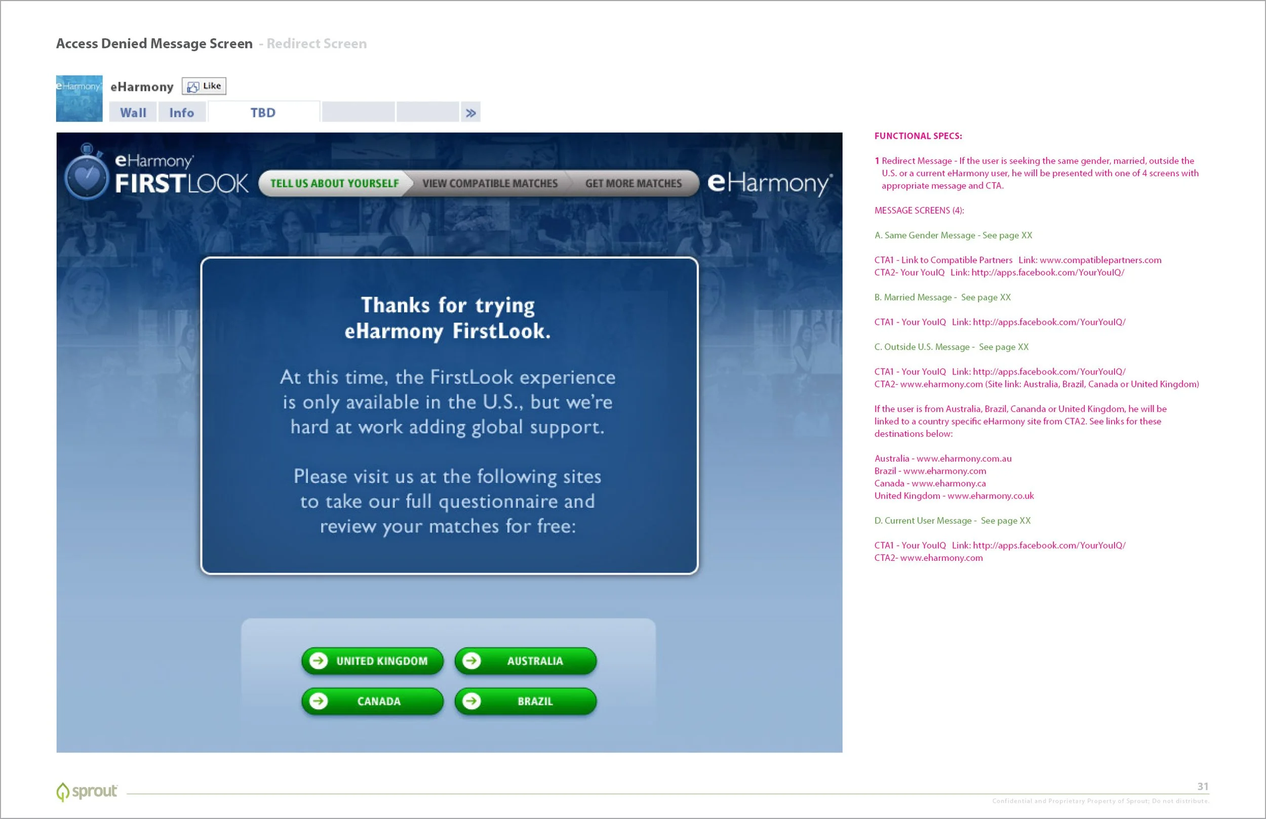
eHarmony FirstLook Matching App for Facebook
Role: Interactive art director and developer
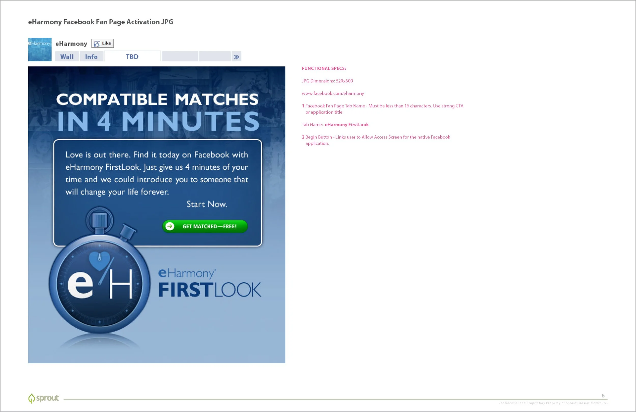
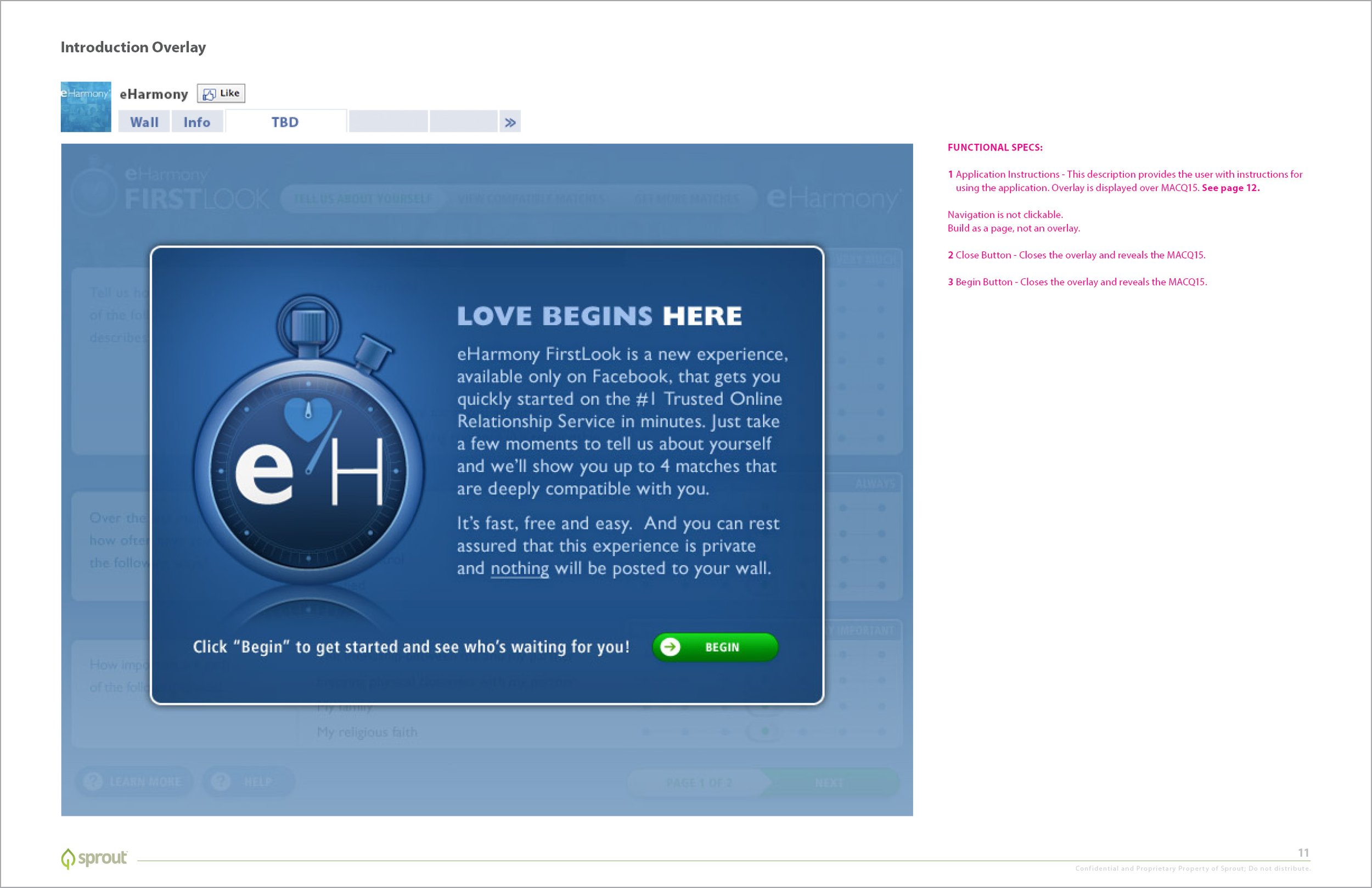
In 2010, a year after Facebook had officially opened up to the general public, eHarmony wanted to engage with Facebook users by way of an interactive user acquisition campaign. Also a thing at the time… Flash apps embedded in brand profiles. You might remember receiving invites to game apps like Farmville and Candy Crush. This Facebook connected app lived on eHarmony’s facebook profile, and successfully converted many Facebook users into eHarmony users.
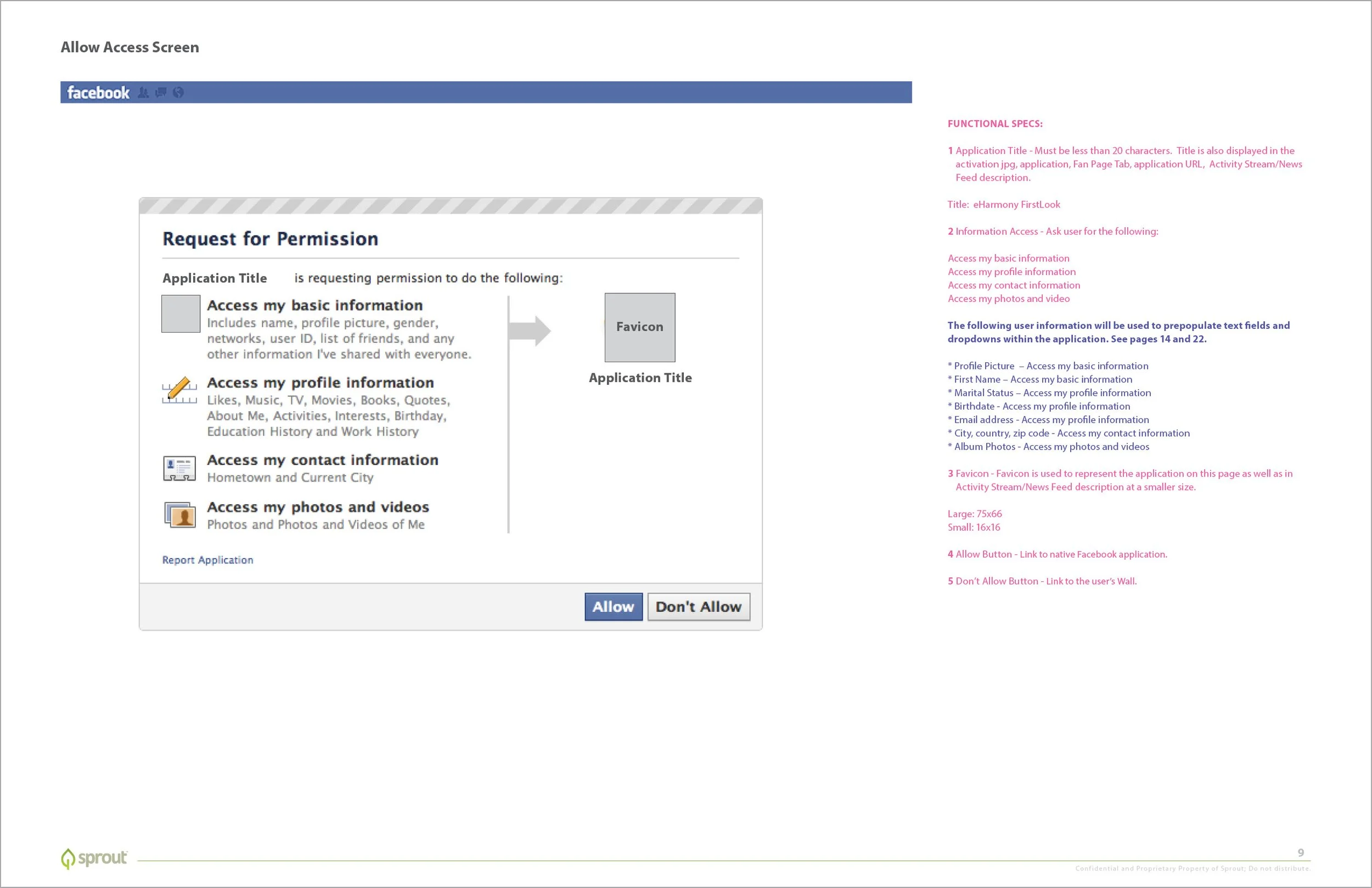
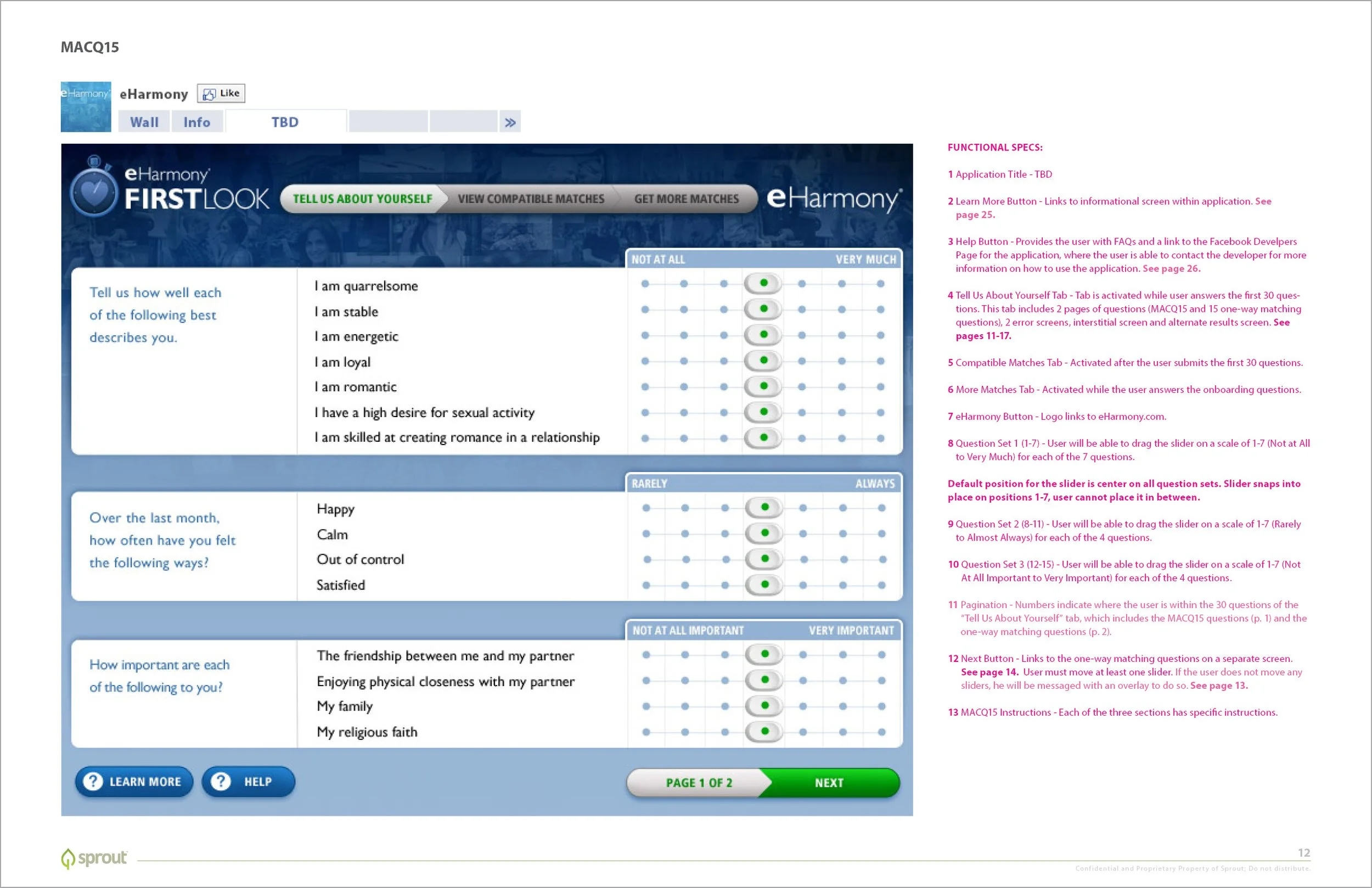
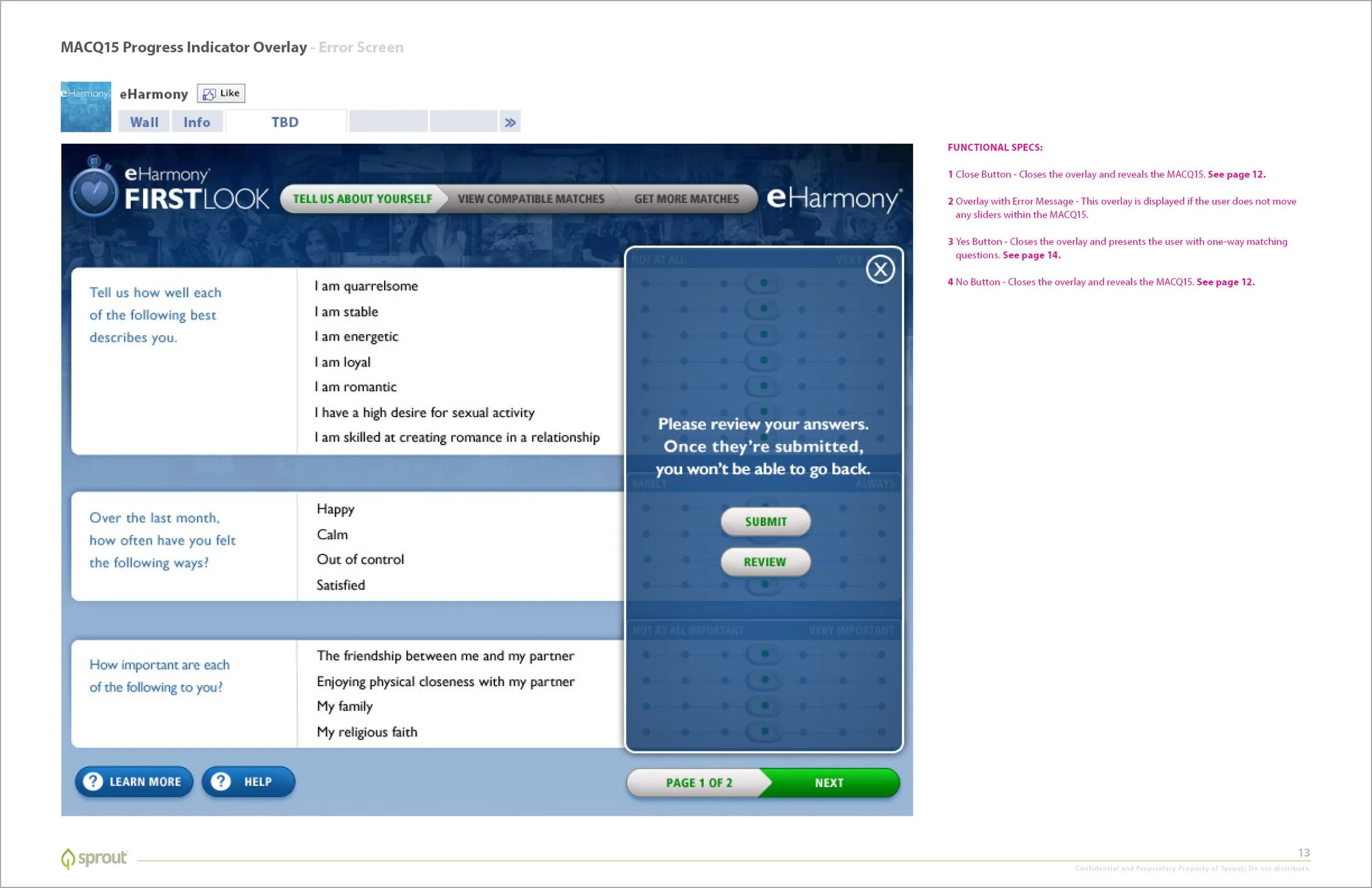
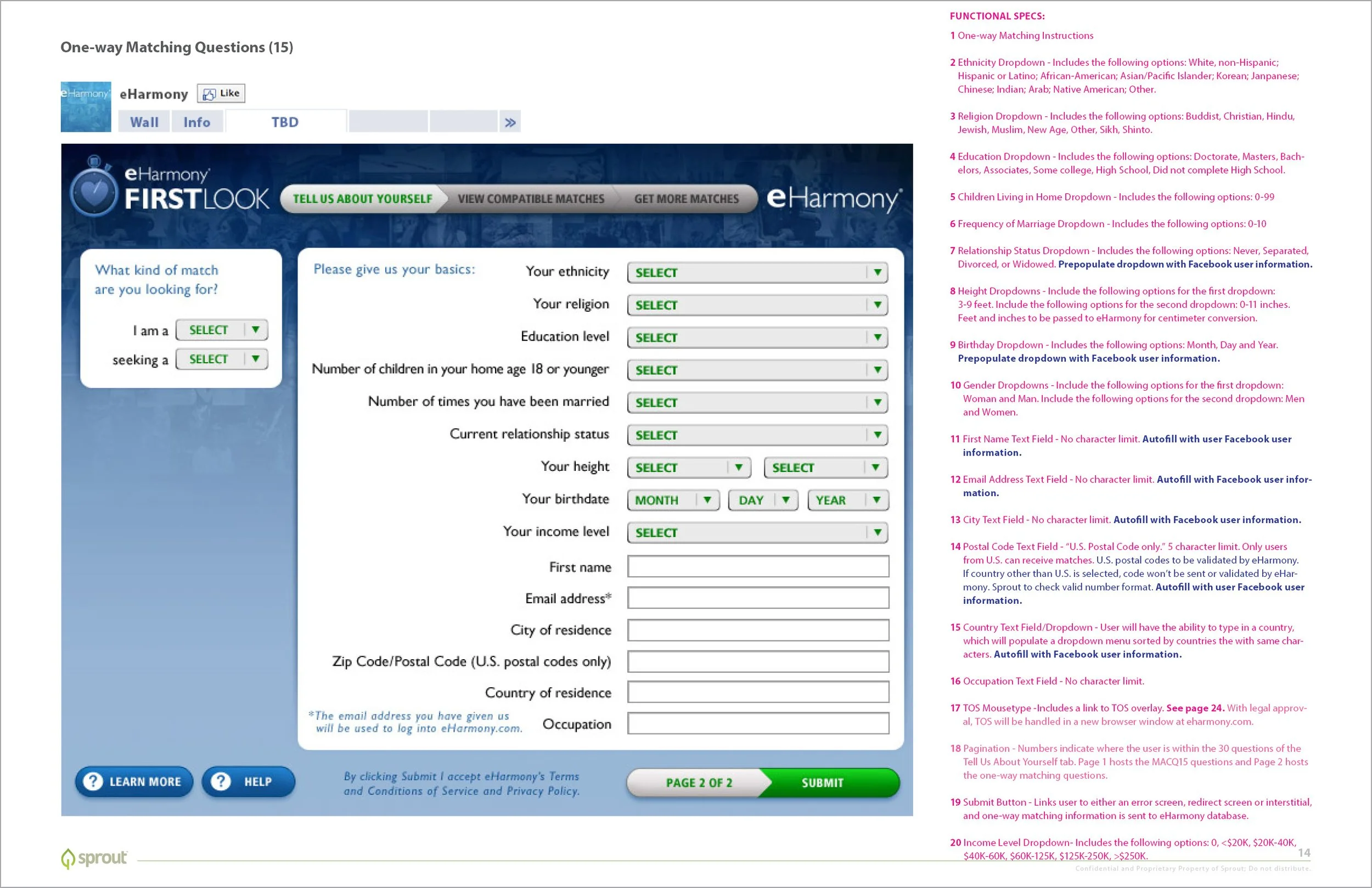
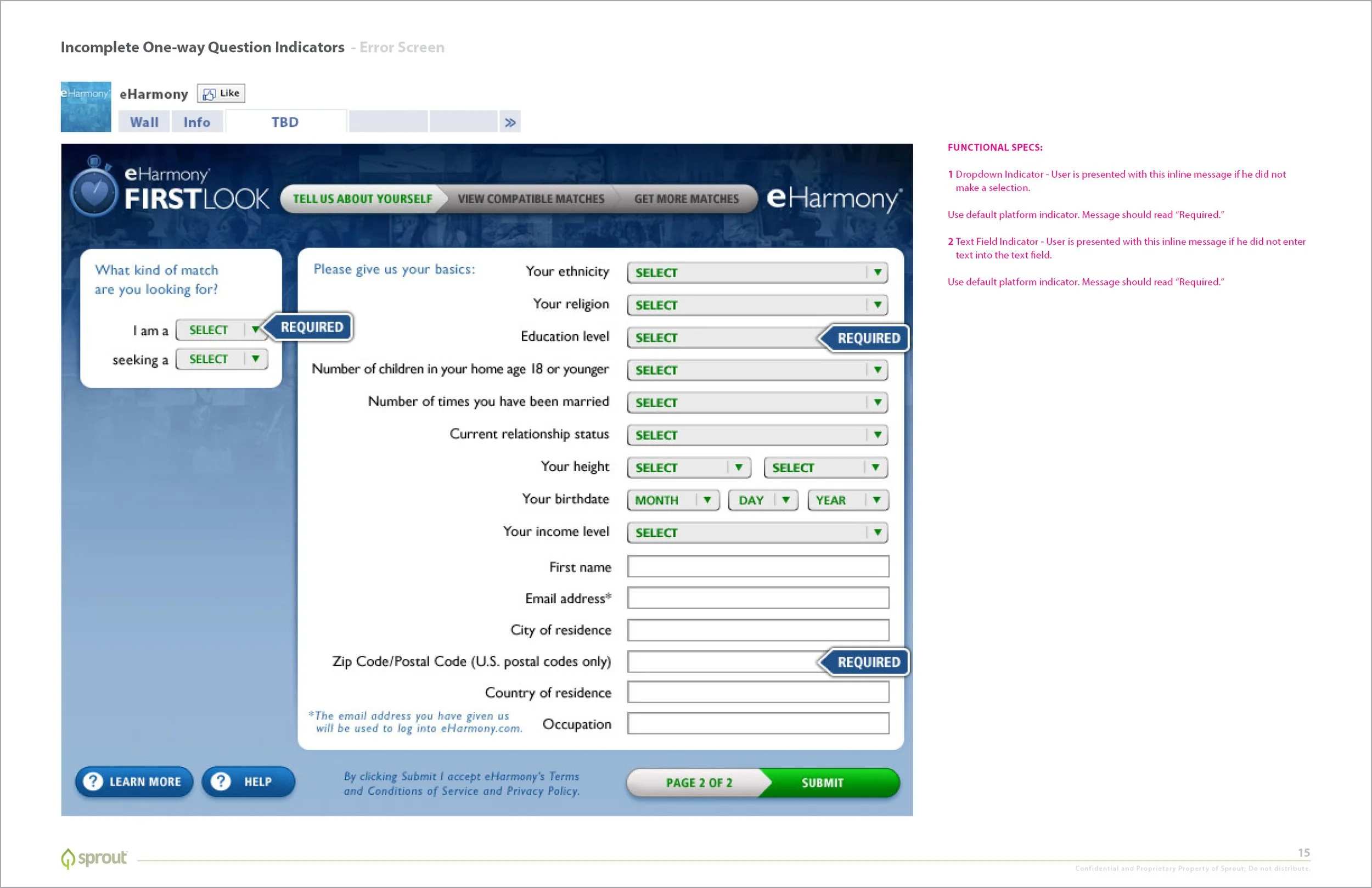
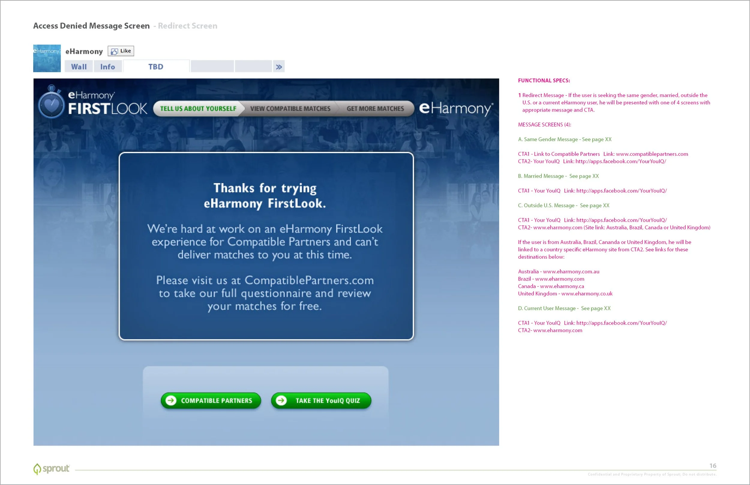
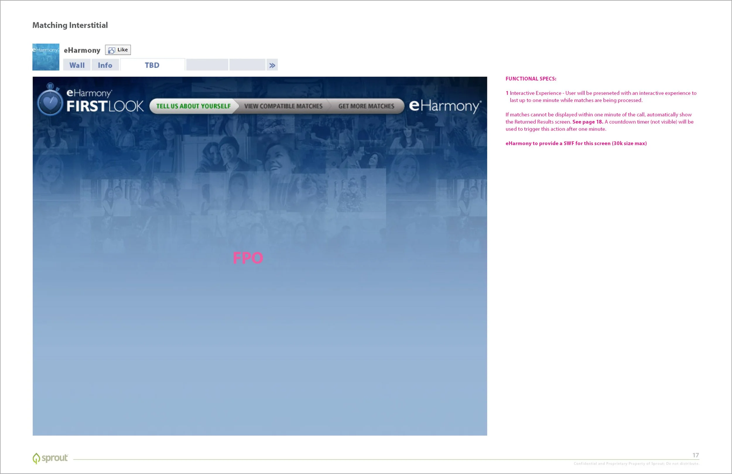
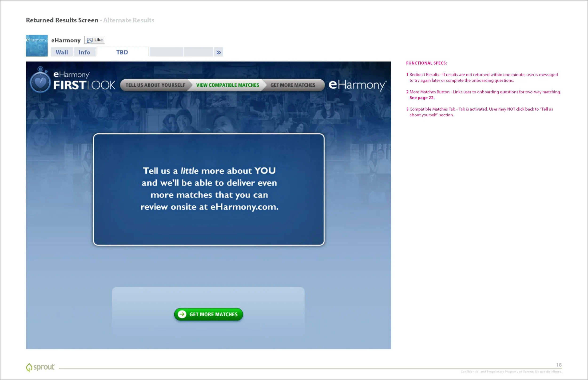
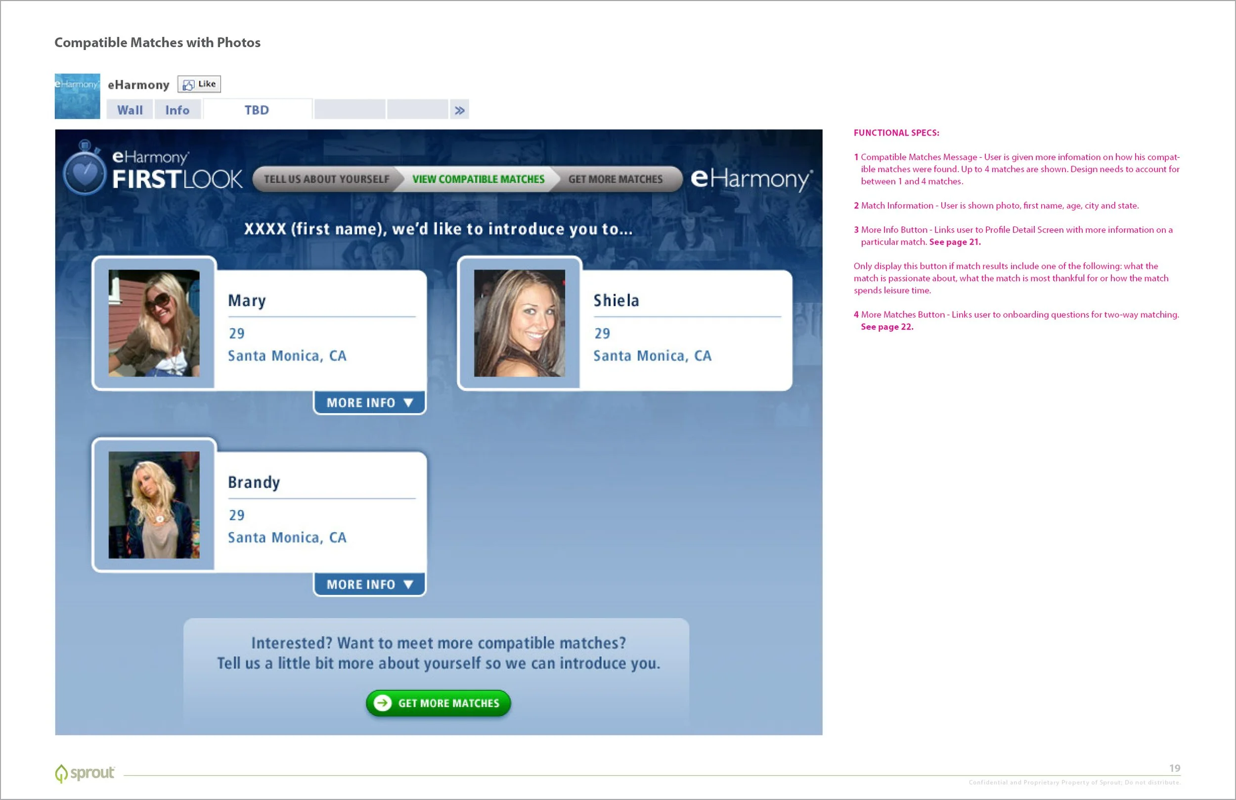
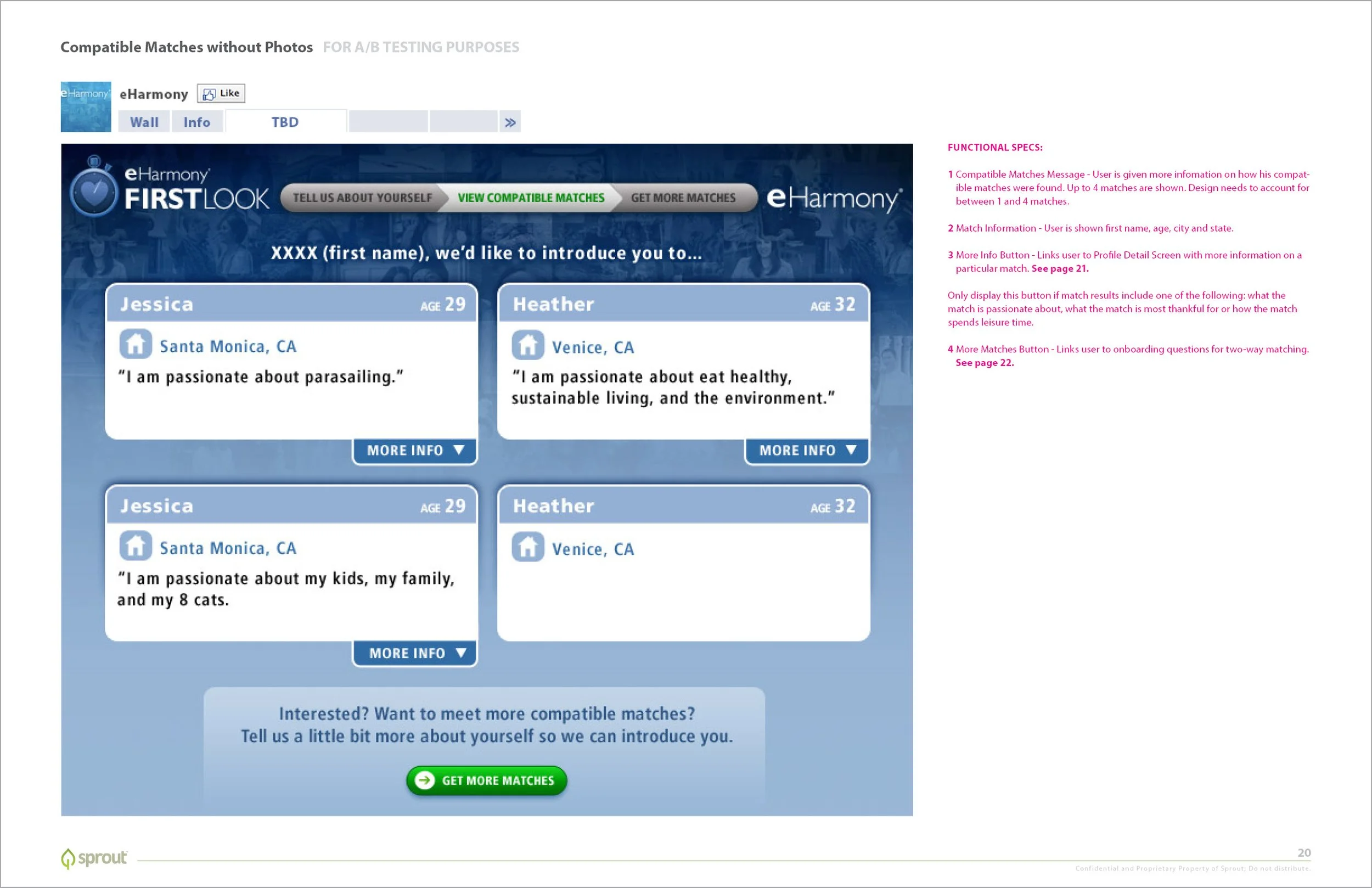
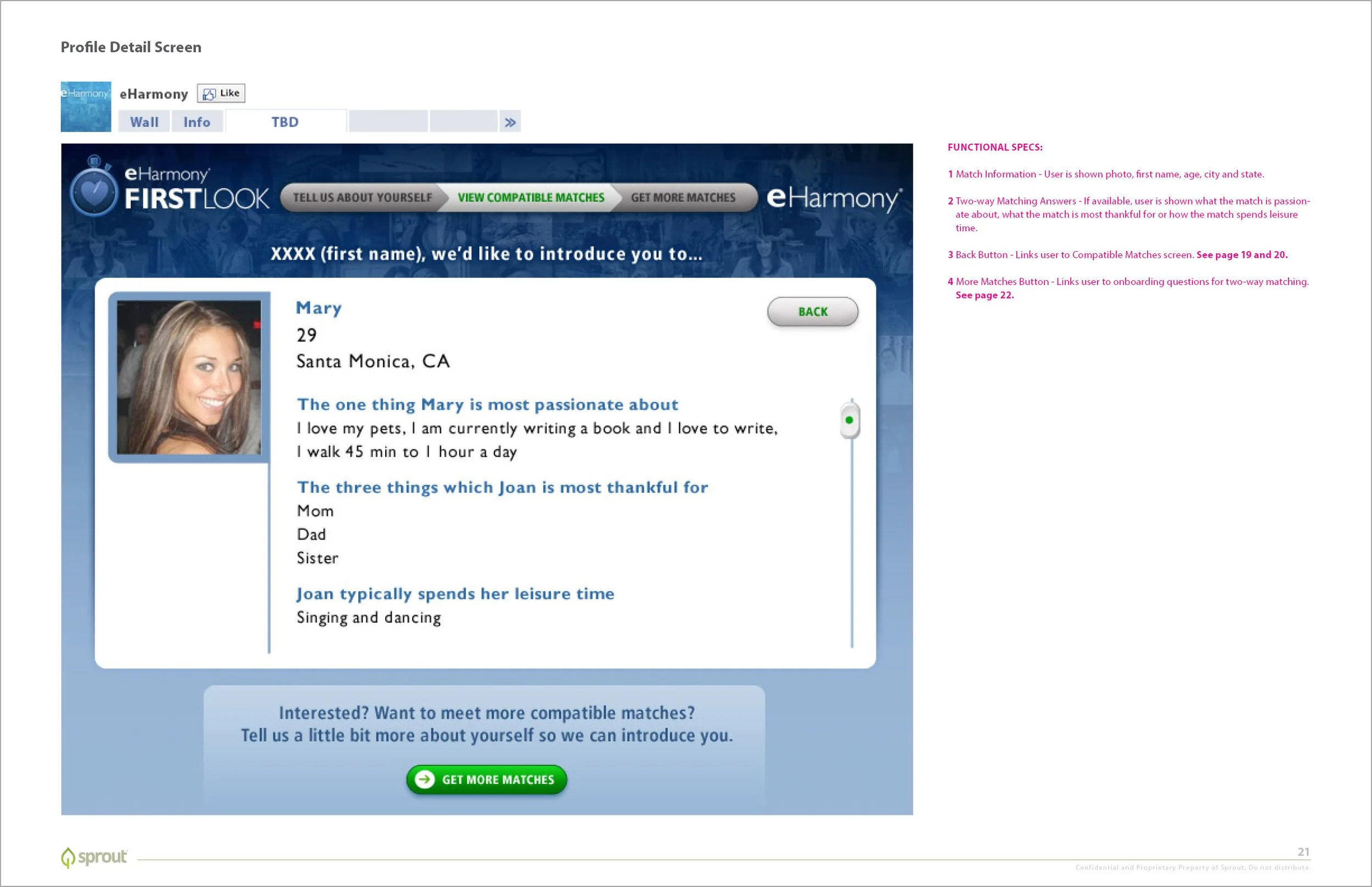
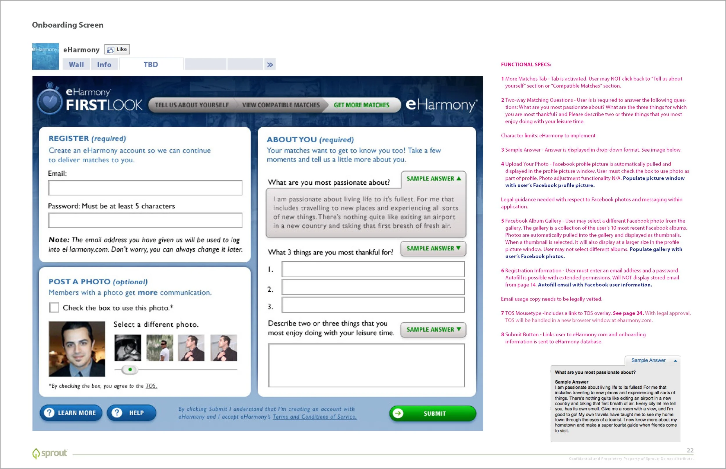
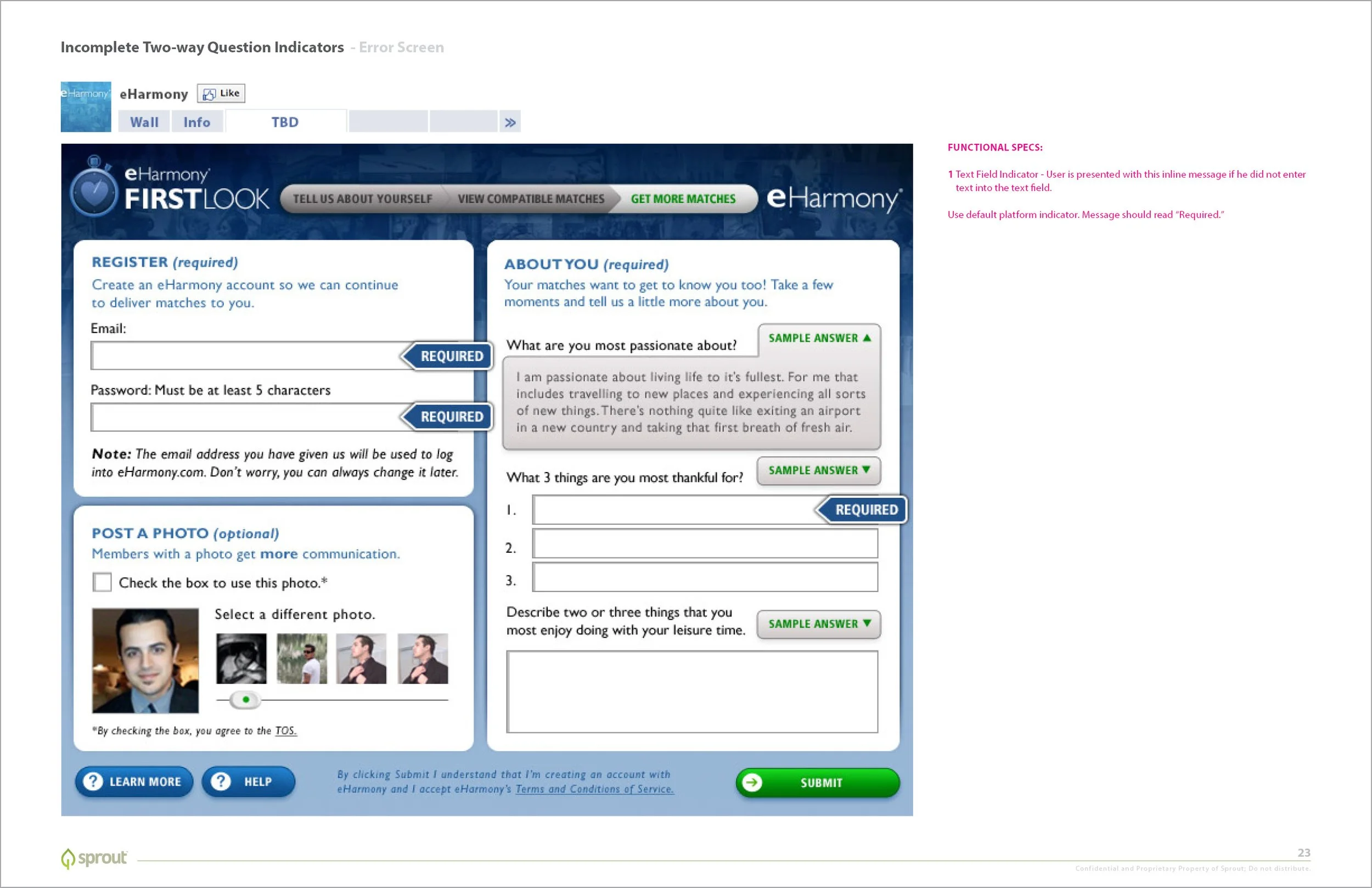
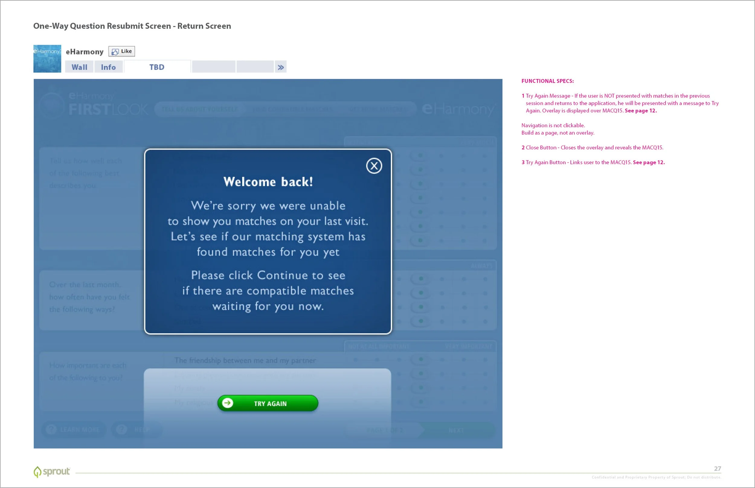
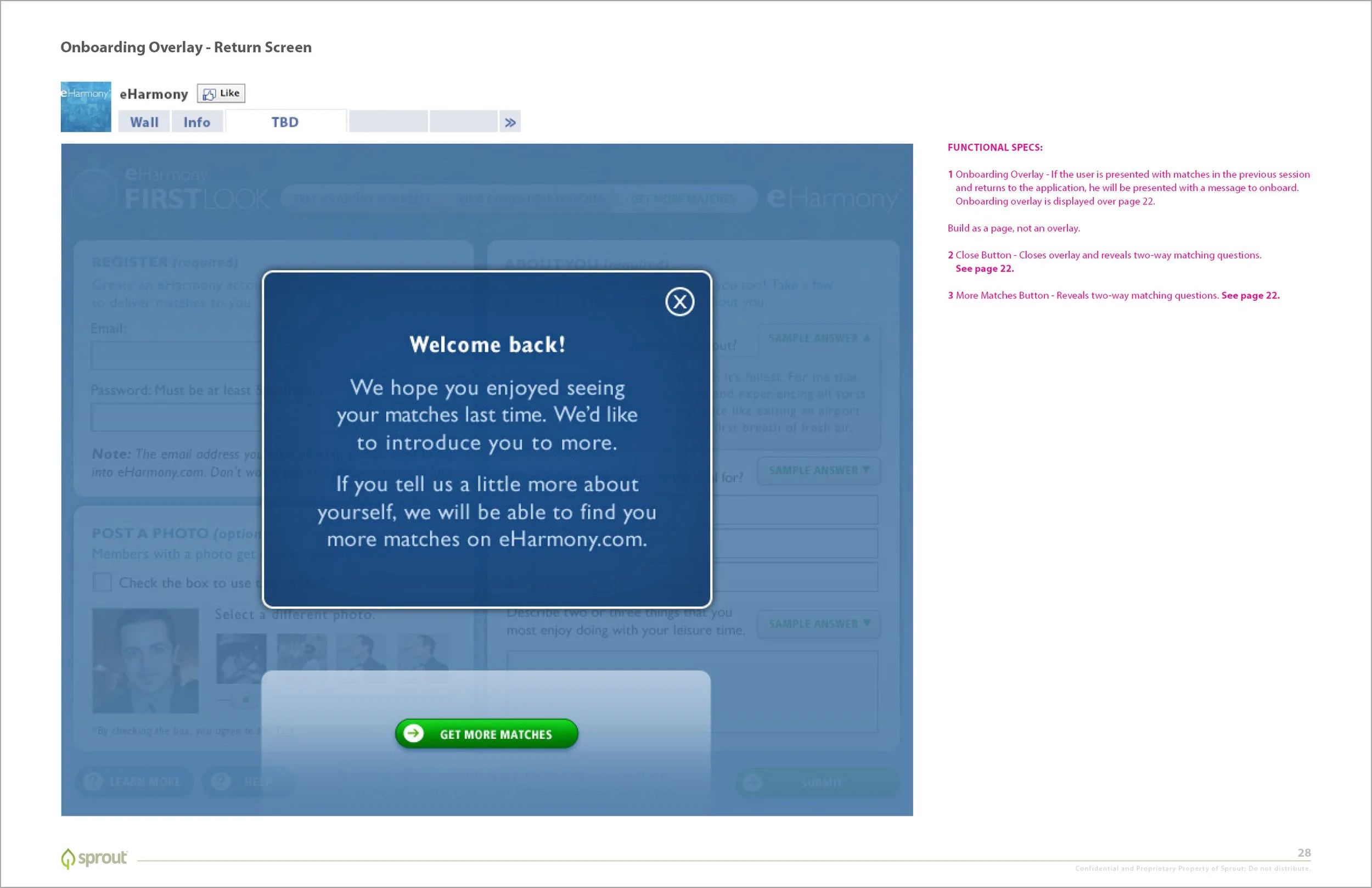
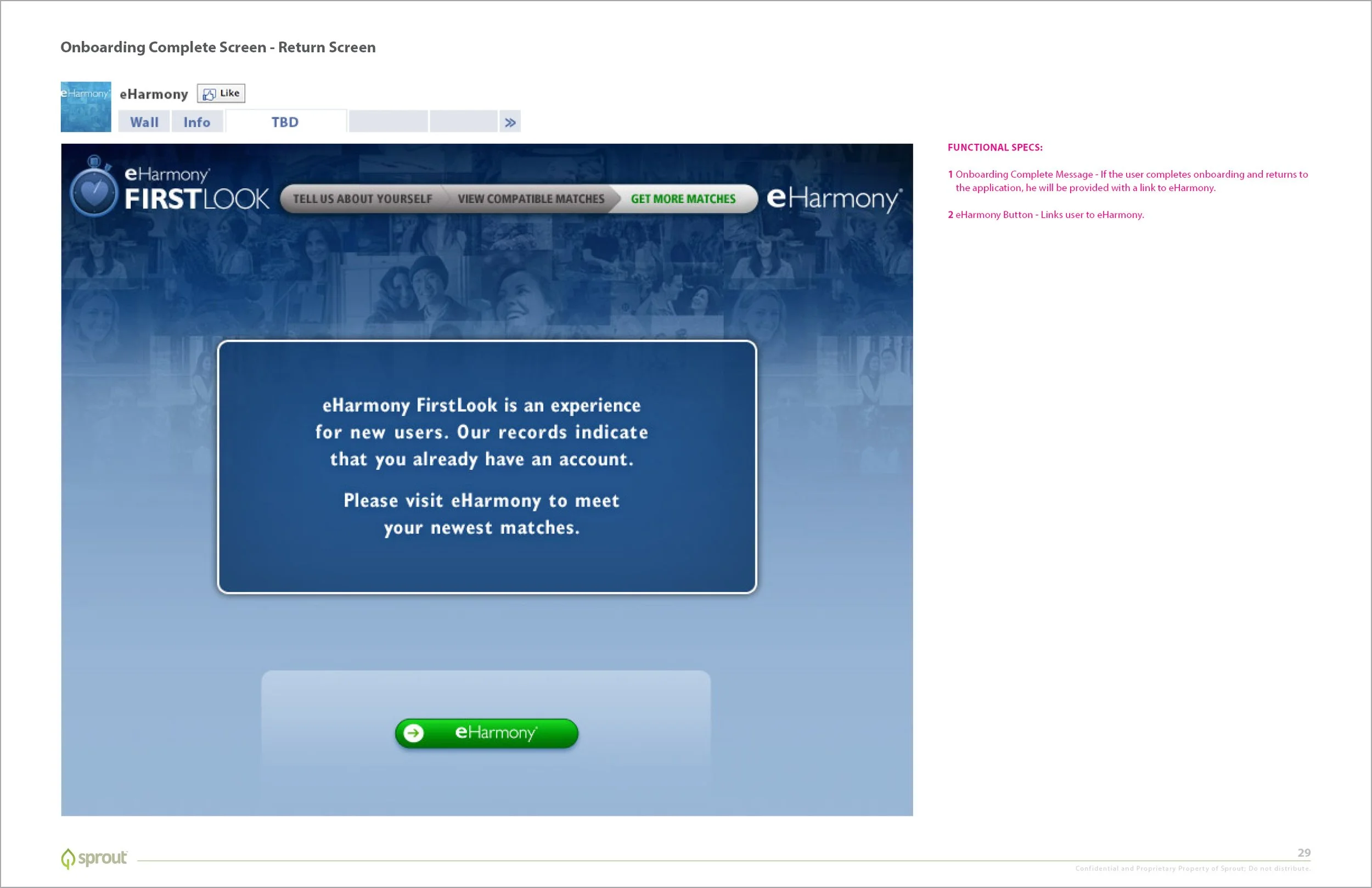
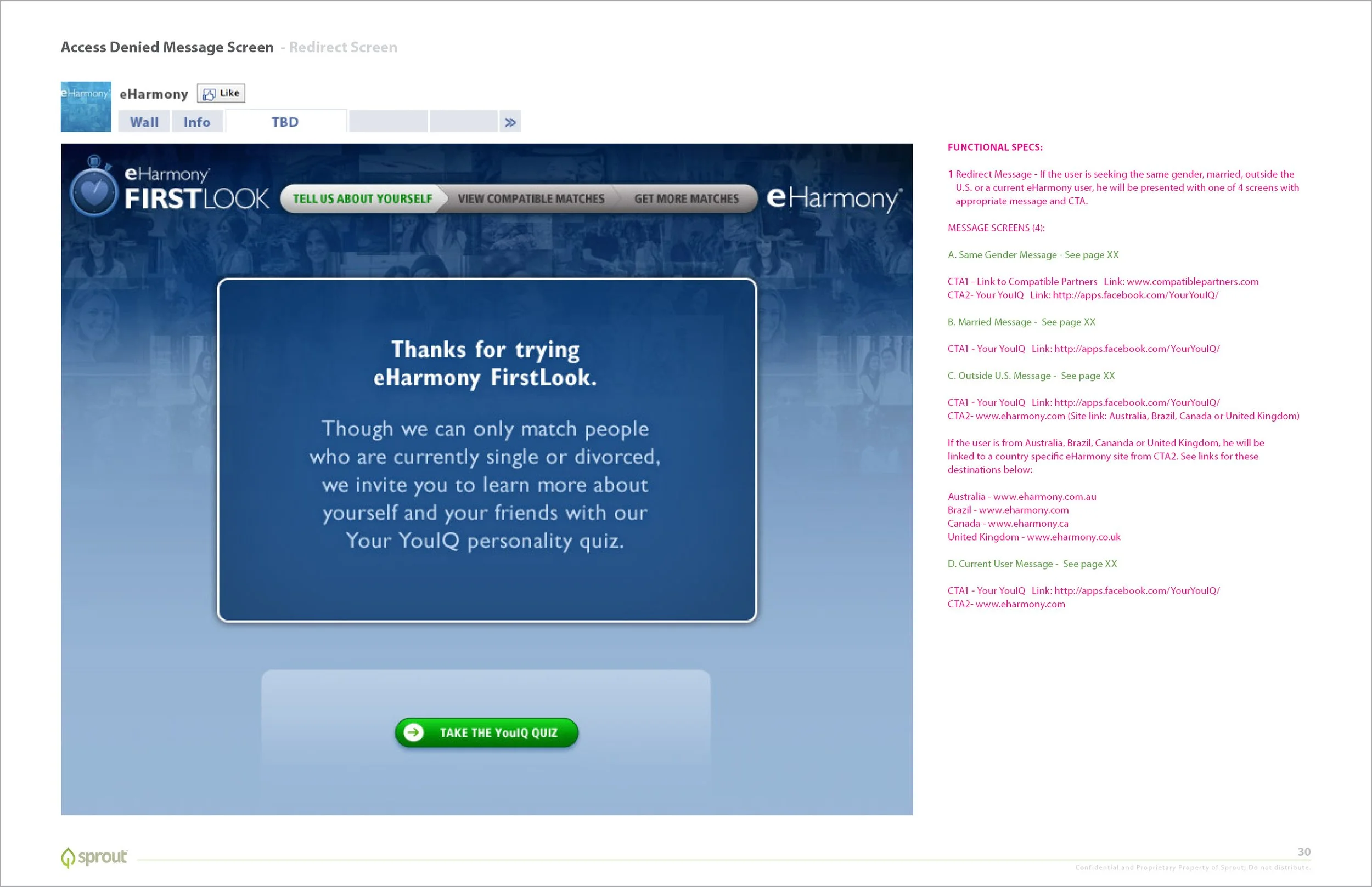
Upon landing on this app, users we shown a list of personal descriptors, to which they could an assign a score of 1-7. Upon submission, they were presented with a condensed user registration experience and shown potential matches to compel them finalize their eHarmony account.

User Experience Wireframe and Functional Specs
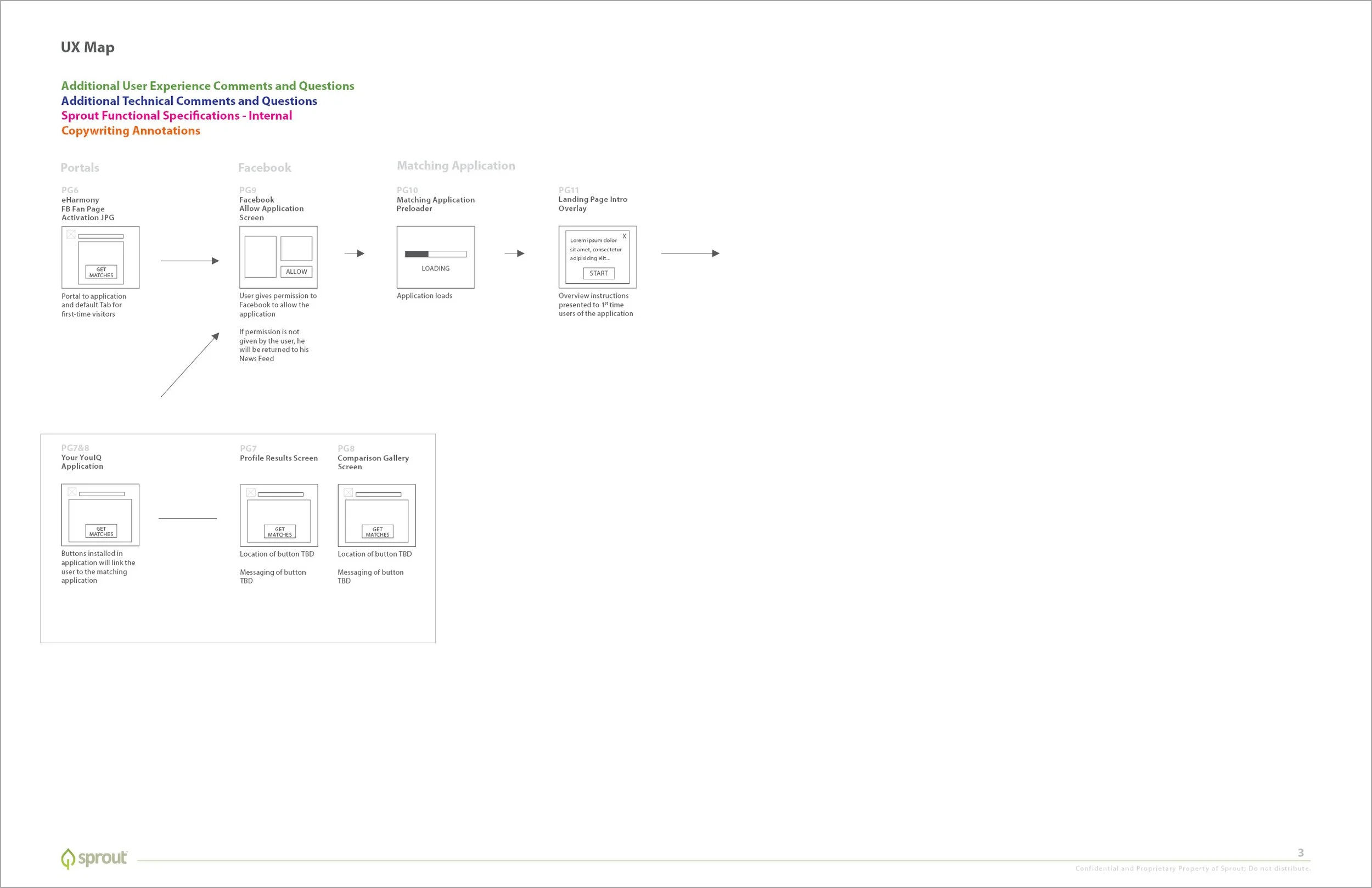
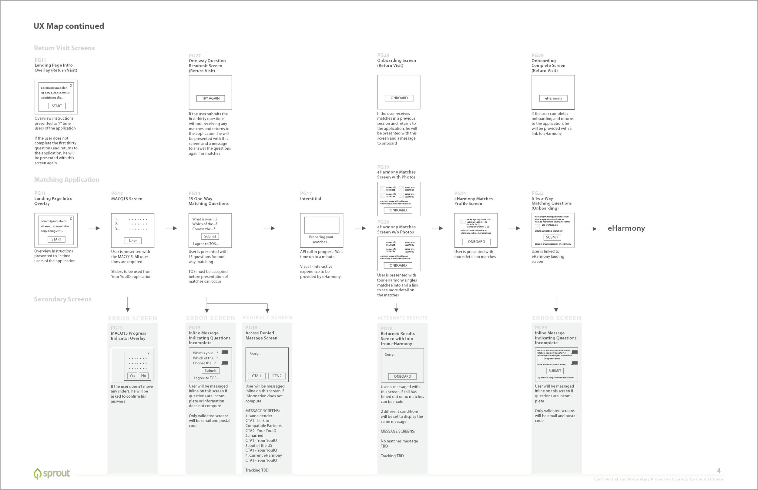
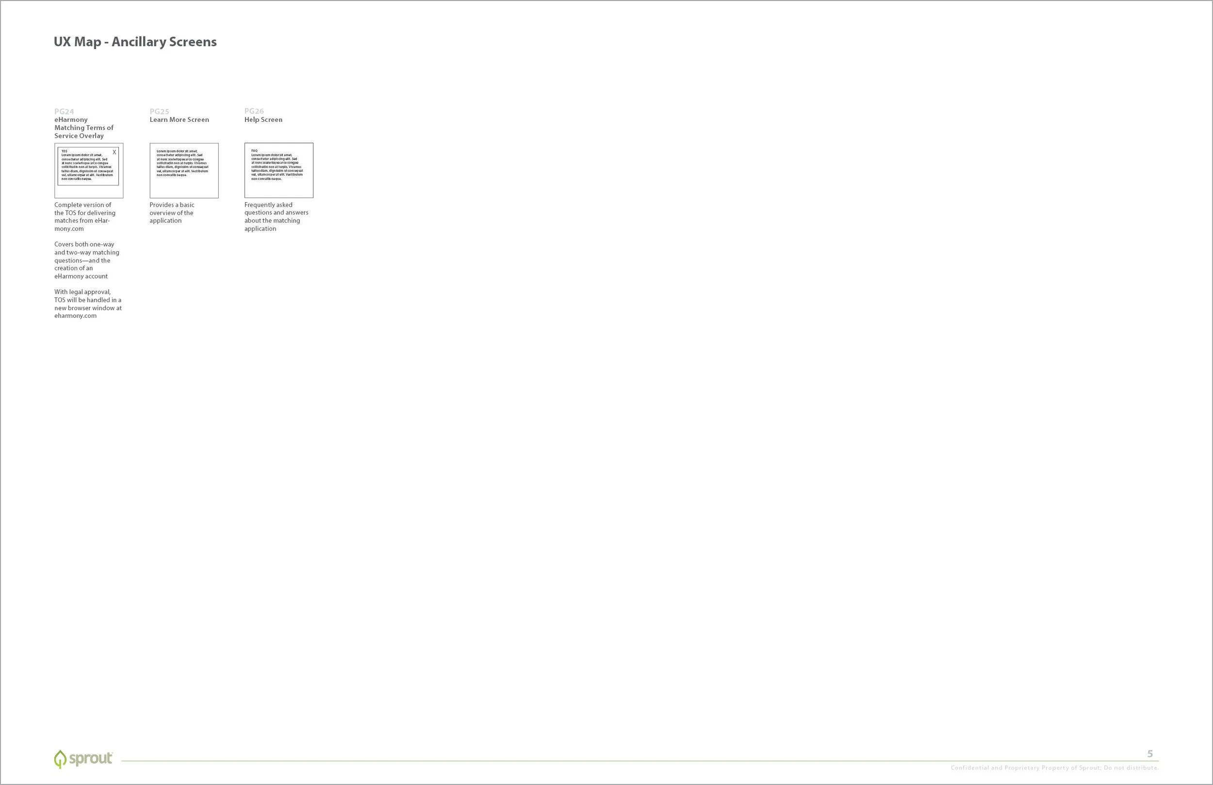
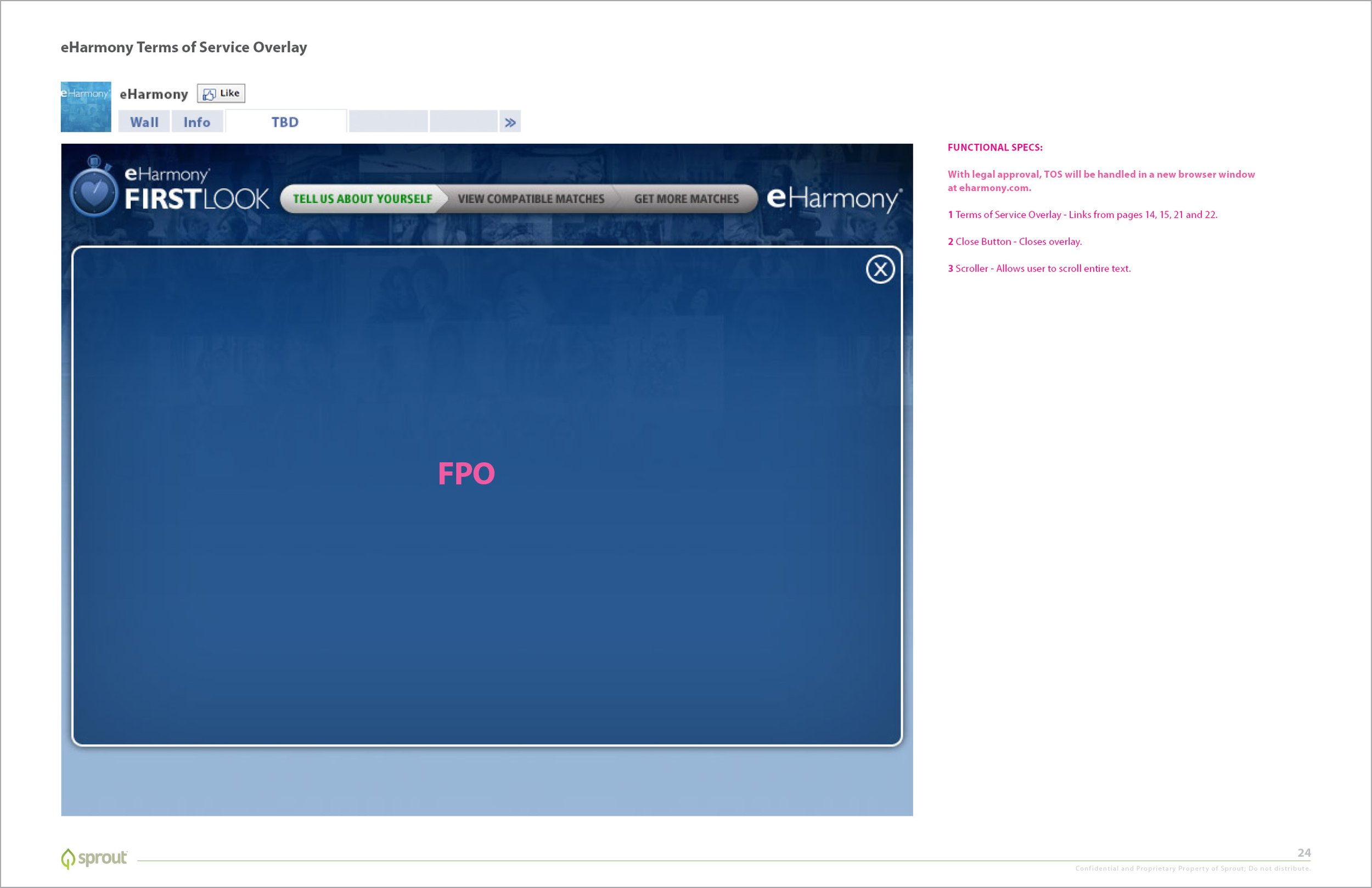
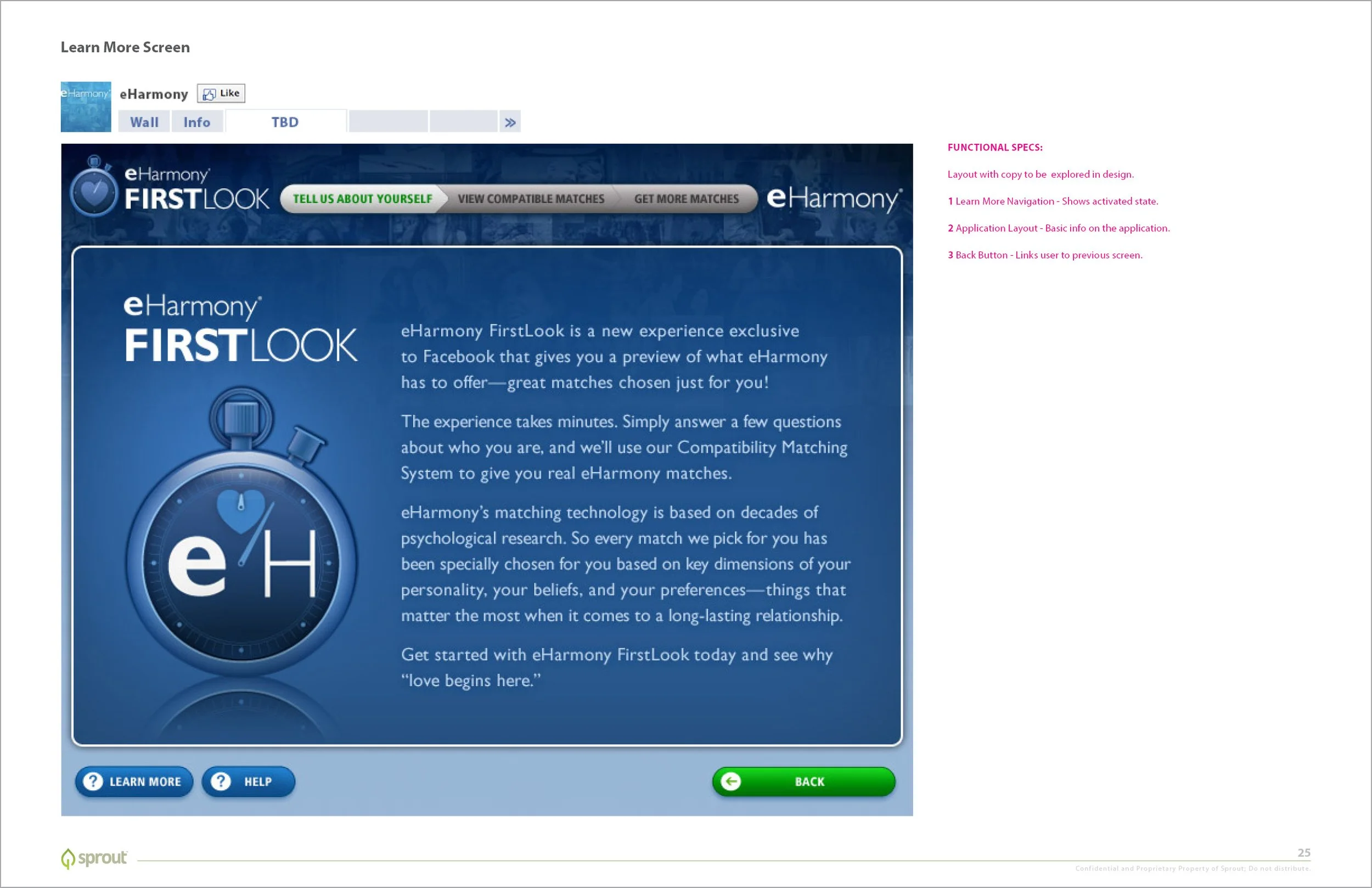
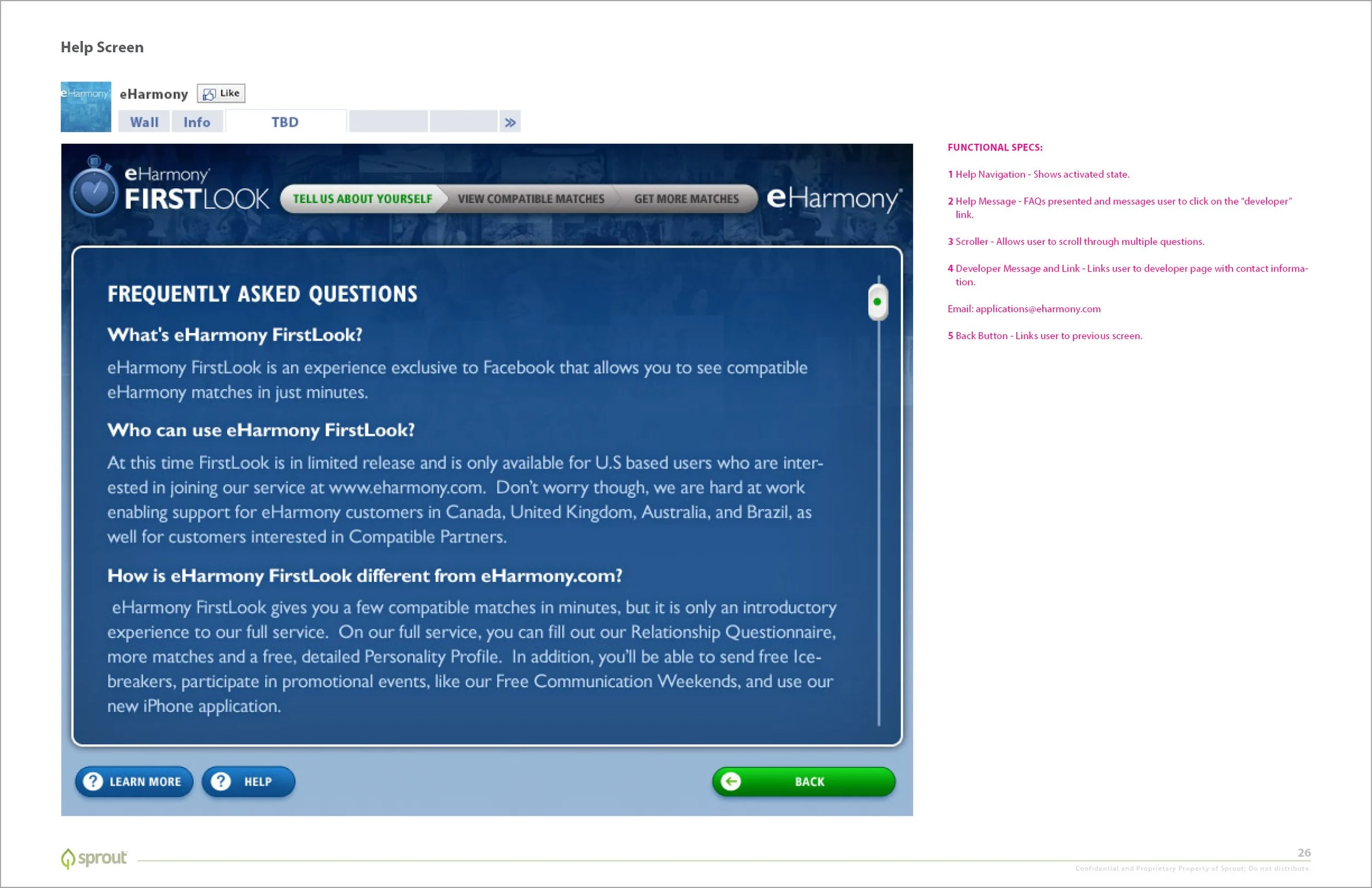
The story for this project is best shown in the details, so I’ve included the pages of Sprout/InMobi’s wireframe document. Prior to this, I provided a few preliminary design options, each with different color schemes, user interfaces, and logo treatments.
As eHarmony’s branding featured dark and light blues, with white type and and green buttons, we arrived at the color scheme and visual weight shown below. And for the UI, I developed a slider element, which clicks into place along stops on a scale of seven ranked options. This is followed by a simple dating profile form and a results screen displaying compatible matches. Finally, a final registration screen creates an eHarmony account login.